27 Feb Enhance research reports with infographics
Insightrix infographics are a memorable, engaging and flexible way to communicate research data
These days, data is everywhere. 
We get it from our televisions, our computers, our phones, our smartwatches and fitness bands – data is ubiquitous.
All that data has one thing in common – it must be communicated in a way that can be readily understood, and if necessary, acted upon in ways that achieve results.
But data can be hard to consume without visual aids like dashboards or charts and graphs. In fact, most of us would like to know the gist of what the data is saying – because not everyone gets excited about correlation or predictions.
We fitness wearable users crave a clean, easy-to-read dashboard. Would Fitbit have succeeded without one? Maybe so, but…
Just like consuming data from a fitness band or summarizing data from primary research – one thing remains – that is, the enthusiasm for well-visualized data.
One way to communicate research data is through using infographics.
Infographics can bring real life to otherwise standard data charts, columns, detailed tables and graphics.
And if you are in the business of buy-in, a thought-out visual representation of the most important numbers from a well-developed report can mean all the difference when it comes to briefing your decision makers.
Data told through infographics can change the way others see the entire story altogether.
Rather than bore your audience with another bar chart or list of bullet points, why not consider an infographic to summarize the most important information?
Infographics tell a complex data story without requiring engagement with the numbers
At their heart, infographics allow the people who see them to walk away with information they can use to make better decisions without having to deep dive into the data.
They help drill data down so audiences can get a view of the research problem – the big picture that we’re all trying to see – as well as answer deeper questions about the results of that research.
What’s more – they are attractive. That means they engage audience attention and hold it long enough for your data story to be told.
Say you’re on your way to meet with the leadership in your organization about a new project you’re hoping to champion. In your industry, there’s little likelihood your executive team is going to give you a great deal of time (and let’s face it – sometimes the attention either) to explain your position with an ask at the end.
You know that to make an impression of the importance of your project, you will have to pitch your plan quickly and convincingly – or risk not having your project approved. But you also know any project in your company must be thoroughly researched before your C-suite will give approval.
Infographics will fill your need by providing an actionable understanding of the research problem and the research data, without the need for your stakeholders to make deep dives into the numbers – and do it in a way that catches their attention and holds it.
In fact, you may be saved hours of explanatory meetings and presentations by presenting a complete data story that can be both quickly and easily understood.
Infographics are flexible
Infographics can be as simple or as complex as you choose to make them. 
What’s great about Insightrix infographics is they should show multiple levels of information – making them ideal for sharing either small data snippets you want remembered, or more intricate data stories you want your audience to engage with.
This means that when you are presenting involved or perhaps data-heavy information in your organization, they are an ideal tool to use to inform your stakeholders in ways that are relatable and engaging – just like in that C-suite pitch we just mentioned.
It also means that having the flexibility to build them in smaller sizes with less data density makes infographics ideal for marketing purposes too.
Say you you’re running a communications campaign that involves letting your potential customers know about the specifications or story of your product. You could develop creative that tells over a period of time – or you could do it all at once through an infographic that explains everything in one package, saving your organization time, effort and resources that could be better put to use elsewhere.
Infographics are shareable
Let’s face it – good infographics catch your attention.
Good infographics present data in a way that is both easily understood (they are functional) and that is aesthetically captivating (they catch the eye).
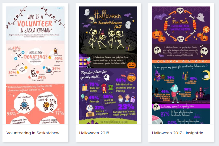
Take the Insightrix infographics below that we produced to promote our omnibus research service, OnTopic®, for example. It conveys several data points in a way that walks audiences through the data story while at the same time, presenting them with a design that captures the attention.

Infographics are a valuable and effective OnTopic® reporting option. Check out the article, Maximize Your Omnibus Survey Results, to learn more.
This aesthetic and functional aspect is usually well appreciated by audiences, who will often share well-designed infographics through their own channels – social media and elsewhere – to spread your message for you.
What’s better – Insightrix infographics facilitate your clients and stakeholders to become better storytellers themselves.
They can take the information the infographic provides and make better decisions based upon it, and they can share it across the organization to others like their leadership team or their stakeholders, allowing them to explain that data story even further.
Infographics make good reports even better
Insightrix infographics make a great complement to research reports. They are memorable, engaging and they are a flexible way to communicate data to clients, stakeholders and general audiences.
They present a data story audiences can understand right away without having to dig into the numbers, their flexibility means they can be tailored to communicate almost any research outcome and they are shareable, empowering clients and stakeholders to tell their data story themselves.
Want to know more about infographics and other forms of data representation? Listen to Episode 14 of Stories of Market Research: The Insightrix Podcast to hear even more about how data visualization and representation can enhance insights reporting.


